Multiple years of WhatsApp Group Activity - Part1
I started getting interested in analysing Whatsapp data when I was looking for free datasets. The first post was within few months of observing my high school Whatsapp group. Then I was added to my college group as well. Some months later, I did the analysis of comparing the two groups. There were very few common users between the two, so it was a good study, inspite of the differing sample sizes.
I have not been active on either of the groups, other than reading over weekend or skimming through some links etc. I went back to my highschool group as I have had that now since 2016 and wanted to see what the variation over time look like. This post is my first summary of that analysis.
Parsing of the Whatsapp text file is also getting complicated, with the export format changing and more complex encodings, which required me to have special rules to process. I am still not 100% on getting to unique senders, which is why the studies below are across senders for now. I will re-run these studies once I get named user mapping to the parsed sender from the export file, so as to only attribute activity when a message is sent but not when user is added or leaves, which is general activity, but not the activity I want to study for now.
The first graph is the full timeline of messages/activities by day across all participants
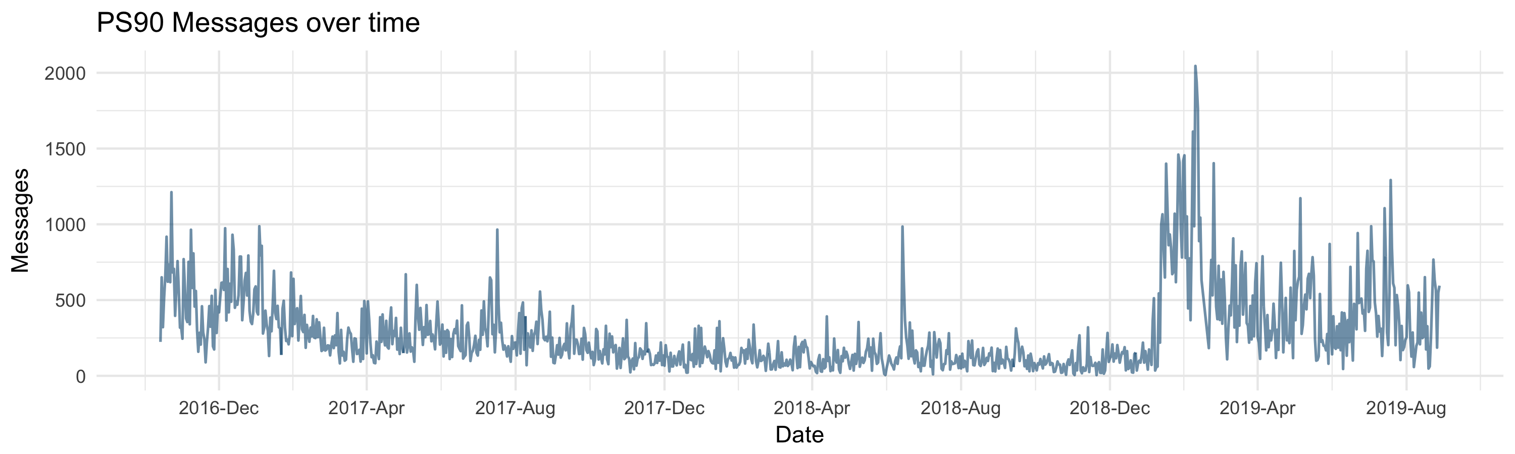
Key questions we will answer later are -
- why does 2018 seems like a year of doldrums
- why is there a peak in July for the last 3 years
- what happened around Jan 2019 that caused a marked jump
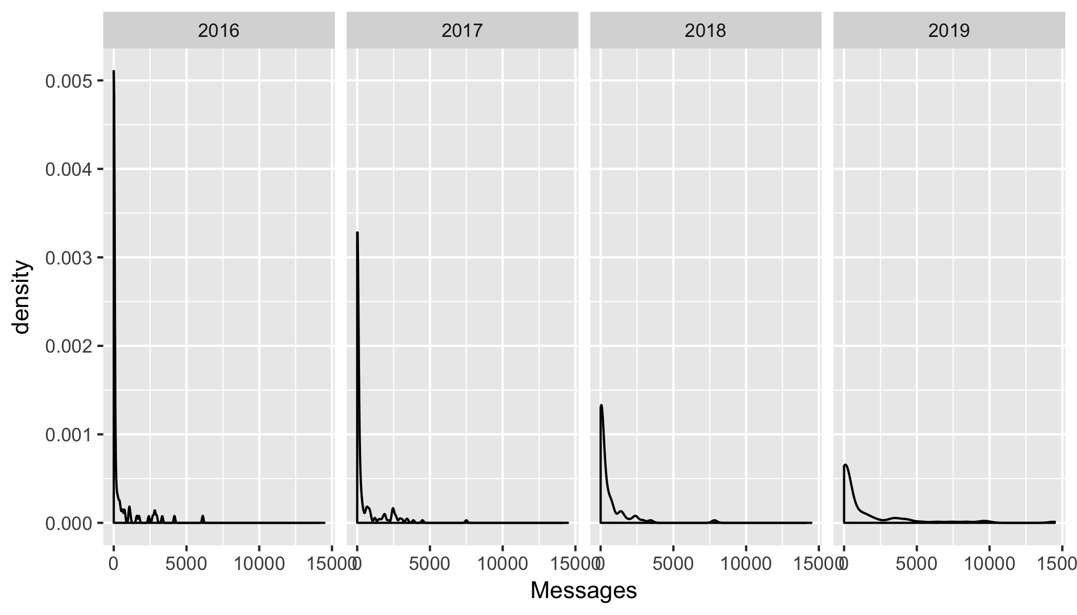
The second graph is to look at yearly variation of message density by senders. This should provide some indication on how the participants’ prolificity in messaging has changed across the population.
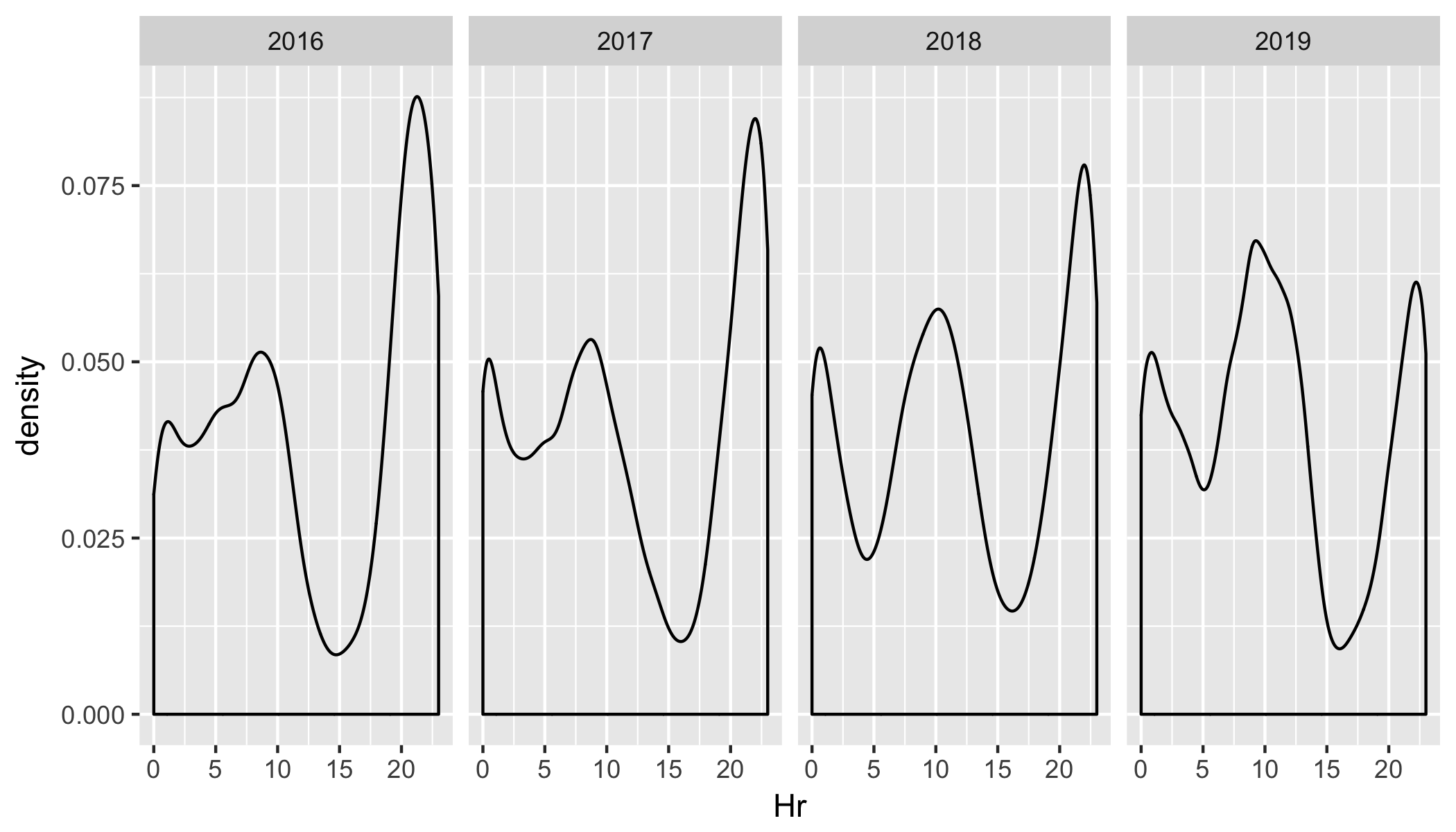
The third graph is to look at yearly variation of message by senders by hour of the day. This should provide some indication on how the participants’ prolificity in messaging during their day has changed across the population.
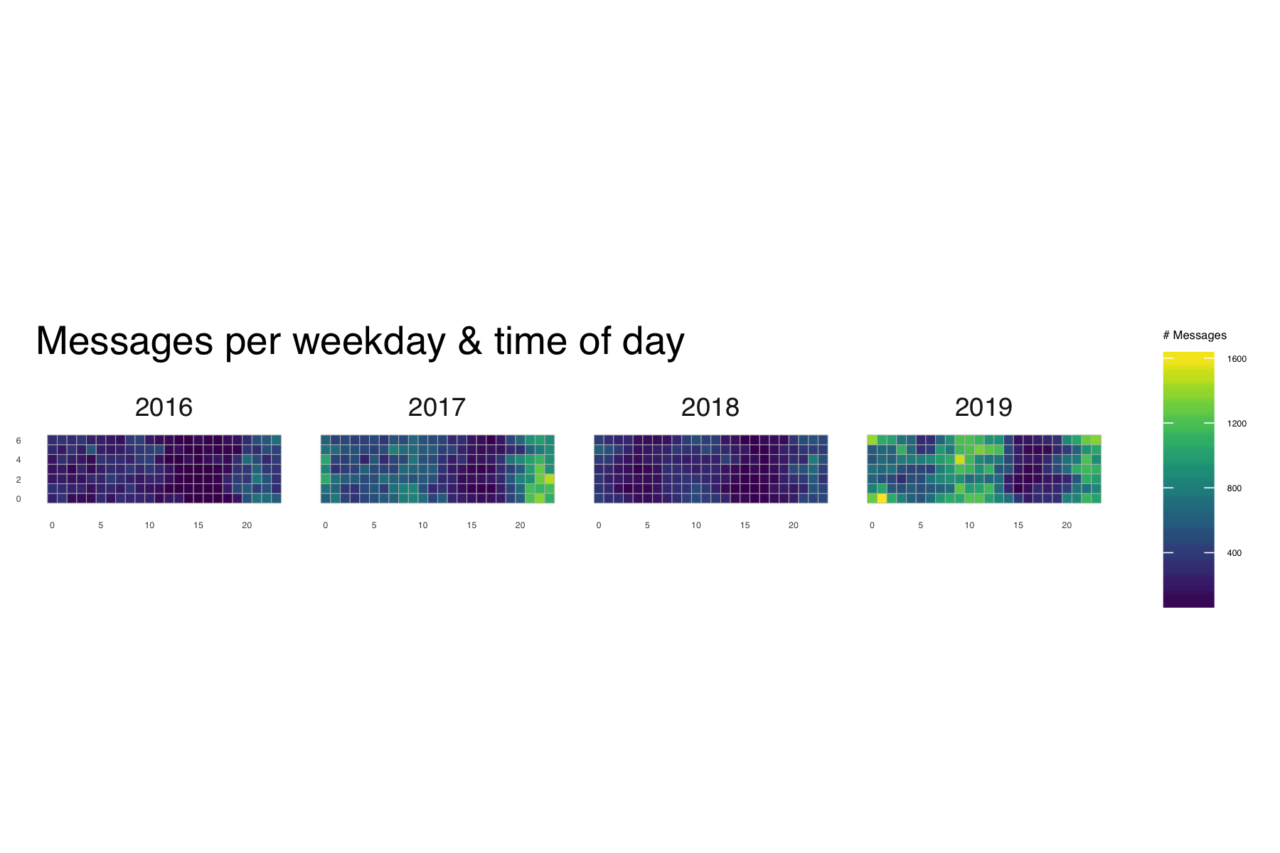
The final graph for this post is around how much the overall chatter in the group across the hours of the day by the day of the week has changed over years using a heatmap view. You can clearly see the doldrums of 2018 we raised in the first graph. Tip: Darker equals low activity and brighter equals higher activity.
The next set of analysis will focus on parsing out senders and seeing if there are any clustering using message activity or content of the message. In addition, I will have to do more cleanup of the data, which might be its own post
God willing, I will do my next post in the next few months instead of next few years :)