Tale of two WhataApp Groups
Few months back I posted the analysis of my high school Whatsapp group, which at that time seemed pretty active and launched me into trying to understand how social groups from our younger days interact now.
The way I got included into the PS90 group was by a friend who also attended the same university (IITM) with me, and majored in the same engineering degree, which meant we were together for 4 years in the same hostel. This provided me an opportunity to analyse the chats from both my high school group (analyzed in my November post) and my university group.
Keep in mind that total members of my university group is less than half of the high school group and the active users are less than quarter in comparison. What follows then is the comparison of macro properties of these two groups.
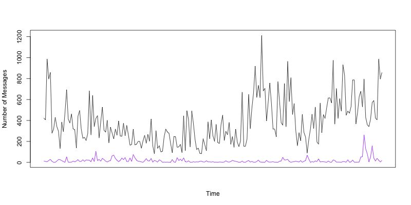
To illustrate the voracity of my high school group to show the quantitative difference, we will start with per day message count from October of 2016 to May of 2017. This is a telling timeseries graph that gives you the volume put out by my highschool friends.
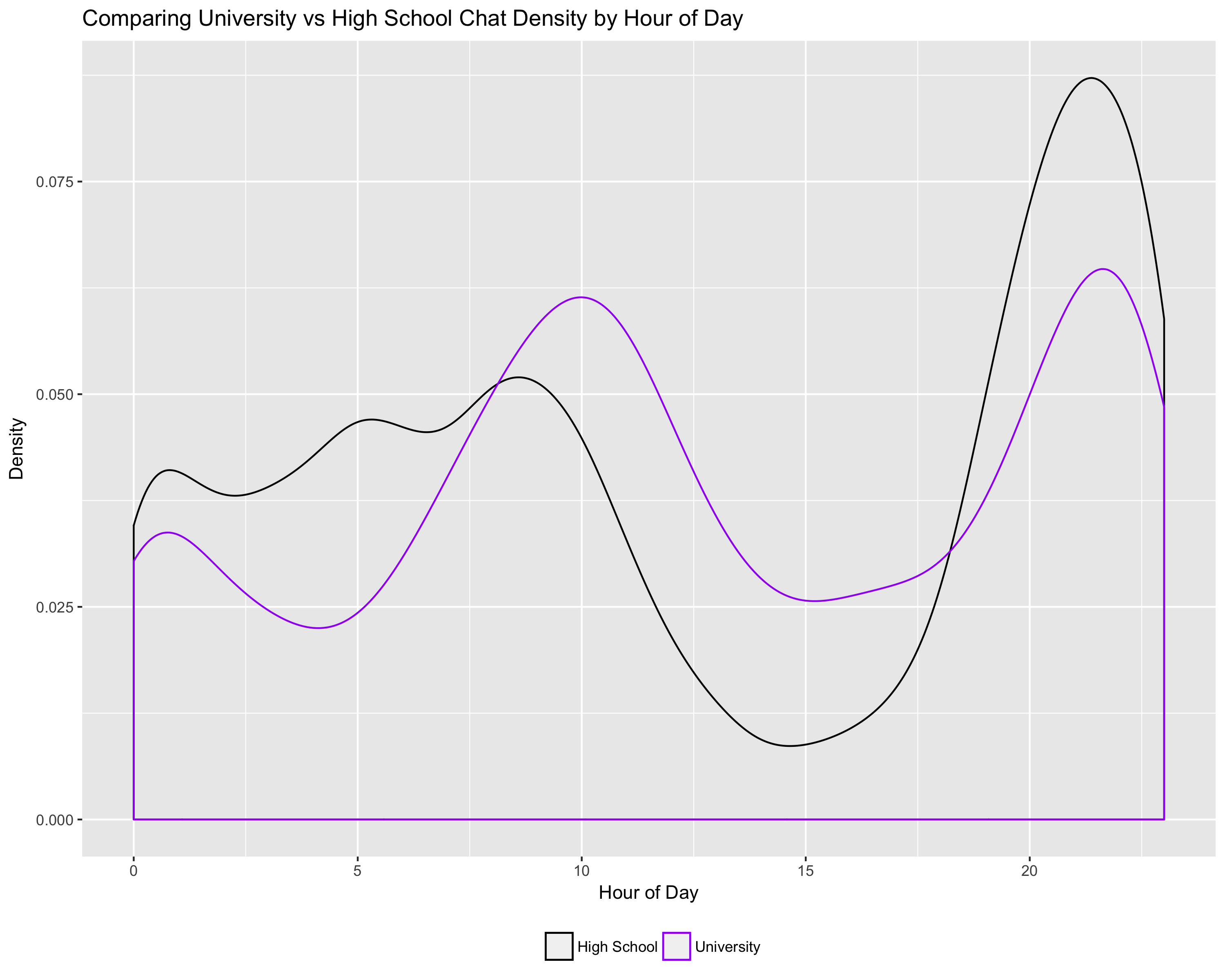
Next lets look at message densities. The message density by the hour of day indicates a similar general pattern between the two groups, except that my high school group reflects the wider distribution of folks across the globe (some in Singapore, Malaysia through middle east before hitting US)
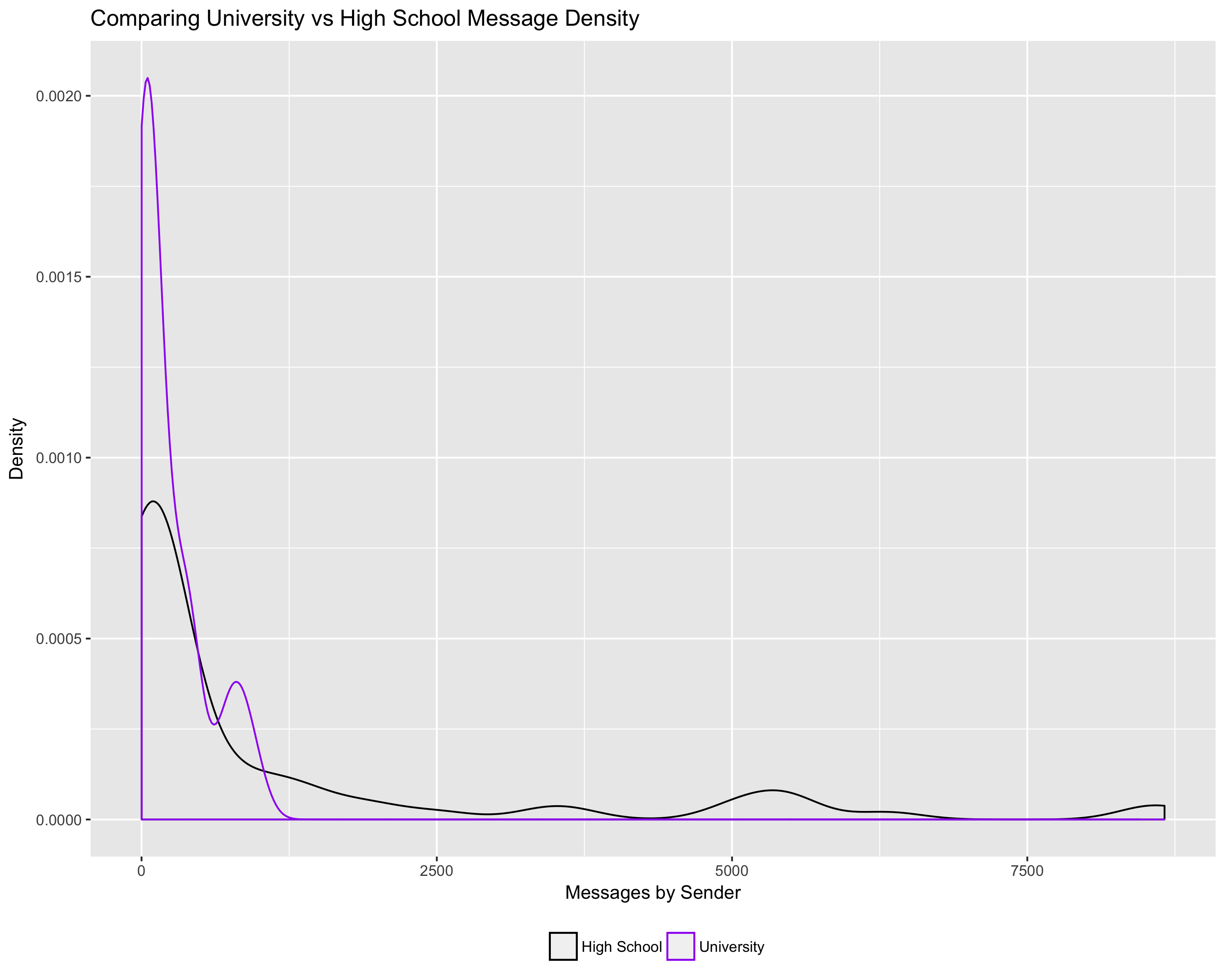
The overall message density by sender clearly shows the quantitative difference between the two groups in terms of voracity based on the sheer number of users in my high school group.
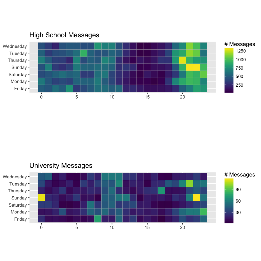
Finally, the weekly heatmap by hour of the day also shows a clear similarity in chat pattern except that my high school friends are active during US night time (or day time India) more than a gradual distribution you see in the university group
In the next installment, we will look at text based analysis of the actual messages to explore topics between these two groups.